UI Responsive Tester
Welcome to Responsive Tester, the ultimate solution for ensuring your website delivers a seamless user experience across all devices. With the growing variety of devices accessing the internet, it’s crucial to verify that your site looks and functions flawlessly on smartphones, tablets, laptops, and desktops.
Responsive Tester allows you to test your web application on mobile and desktop screens simultaneously. Adjust screen resolutions to simulate different devices, ensuring that your design and functionality remain consistent across all platforms. With each click, capture screenshots on both mobile and desktop views, helping you to optimize your site for a flawless, responsive experience.
Our UI Responsive Tester lets you test your web application on mobile and desktop screens simultaneously. Adjust screen resolutions to simulate various devices, ensuring your design and functionality are consistent across all platforms. With each click, the tool captures screenshots on both mobile and desktop views, allowing you to optimize your site for a flawless, responsive experience. Streamline your testing workflow today.

- Test Across Multiple Devices. Preview your website on various screen sizes, including smartphones, tablets, laptops, and desktops, ensuring consistency and usability across all platforms.
- Evaluate Responsiveness. Assess how your site responds to different screen sizes and resolutions, identifying any layout or design issues that may arise on specific devices.
- Check Compatibility. Ensure compatibility with various web browsers and operating systems to provide a consistent experience for all users, regardless of their chosen platform.
- Optimize Performance. Test loading times and performance metrics across devices, optimizing your site for faster load times and improved user engagement.
- View Interactive Previews. Interact with your site in real-time within the tester, navigating menus, clicking buttons, and scrolling through content to accurately simulate user interactions.
Responsive Tester empowers you to create user-friendly experiences that adapt seamlessly to the diverse landscape of digital devices. Start testing your site’s responsiveness today and ensure it looks great and performs flawlessly on every screen!
How to Perform Responsive Testing
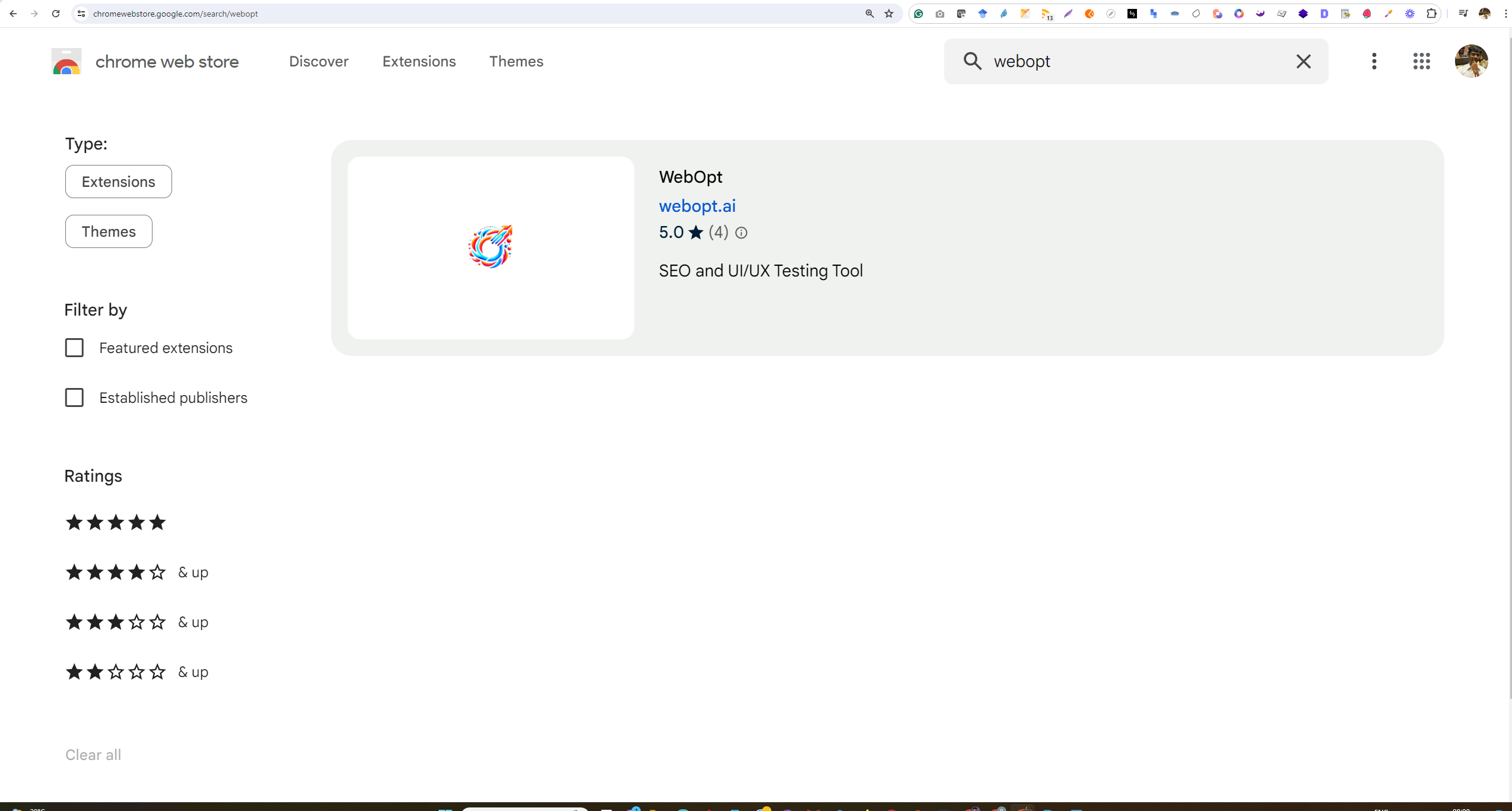
1. Go to Chrome Store and search for webOpt
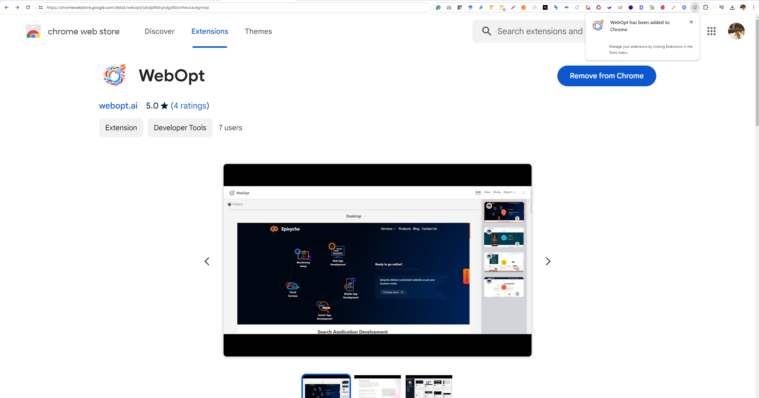
2. Install the extension.
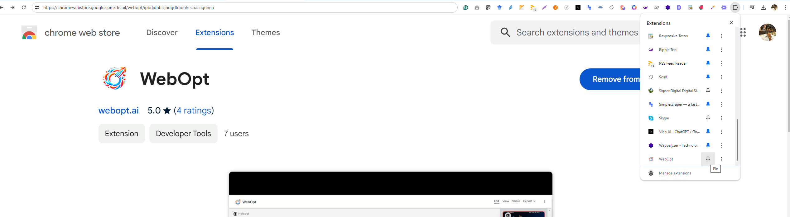
3. Pin the extension.
5. Open a website you would like to test, and click on the extension icon.
6. Choose the type of testing you would like to perform, for example: if you option for Responsive testing and start the test by clicking the Start Capturing button.

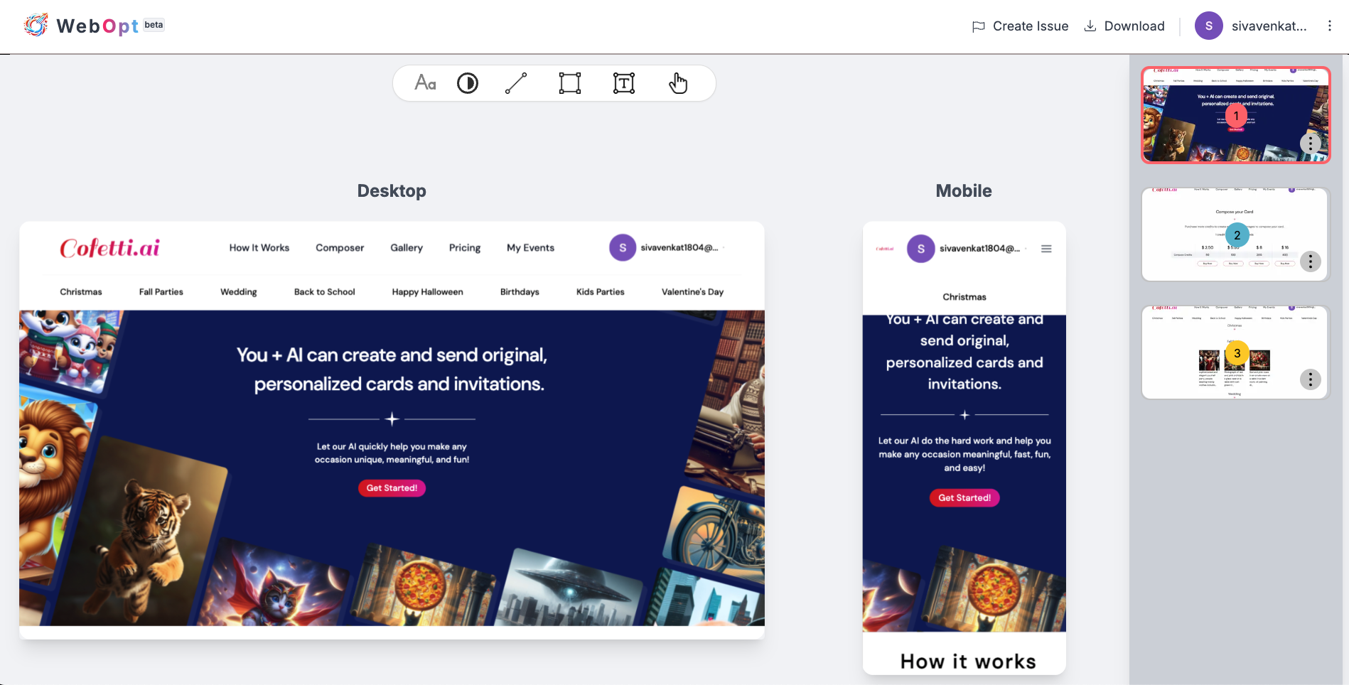
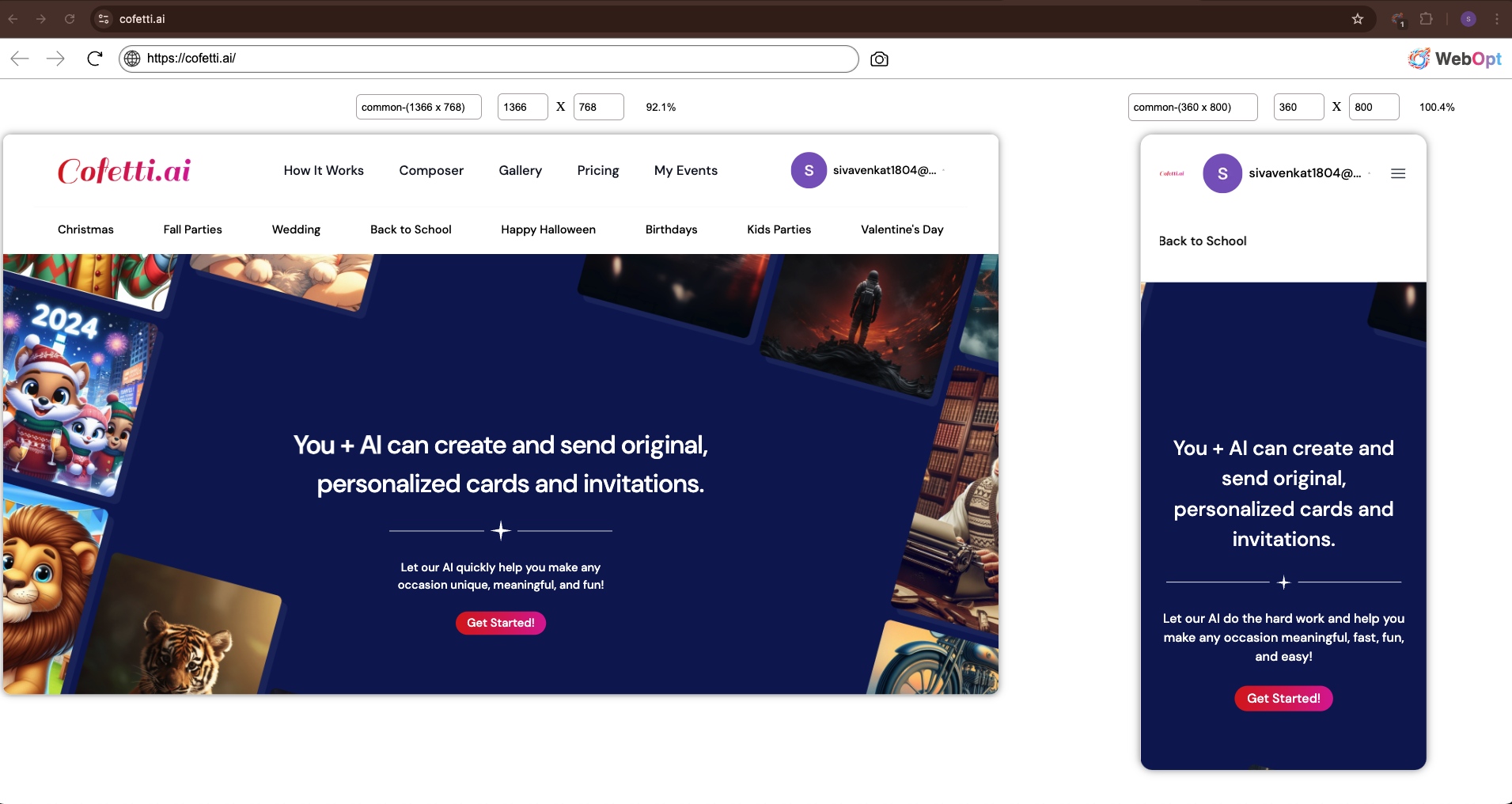
7. As you start the test, the responsive testing of a website, Cofetti.ai, on desktop (1366x768) and mobile (360x800) resolutions. It verifies the layout and user interface consistency across different screen sizes.
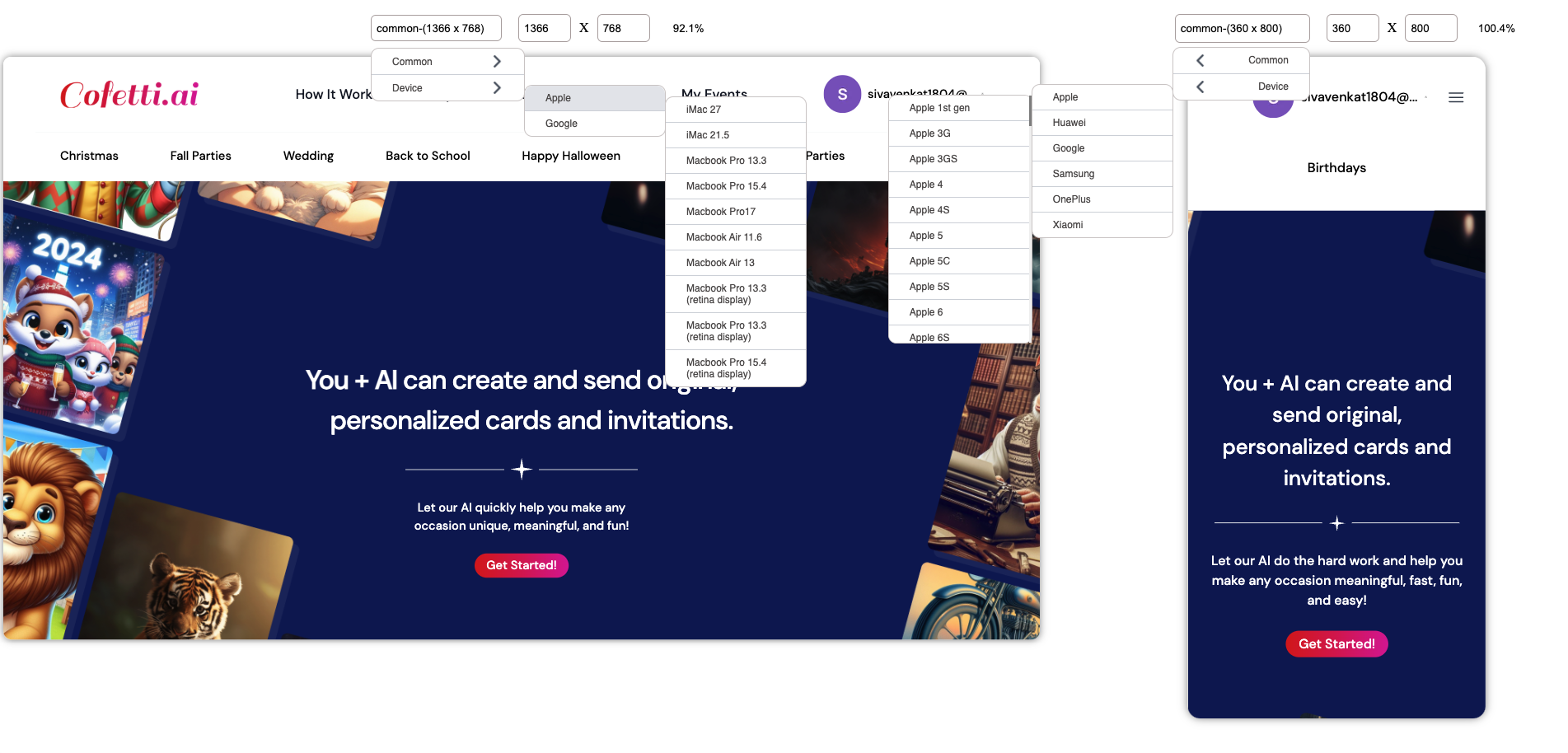
8. This image shows a device simulation and resolution testing process for the website Cofetti.ai. Dropdown menus allow the tester to select different devices (e.g., Apple or Android) to check the responsiveness and user interface consistency across various screen sizes.
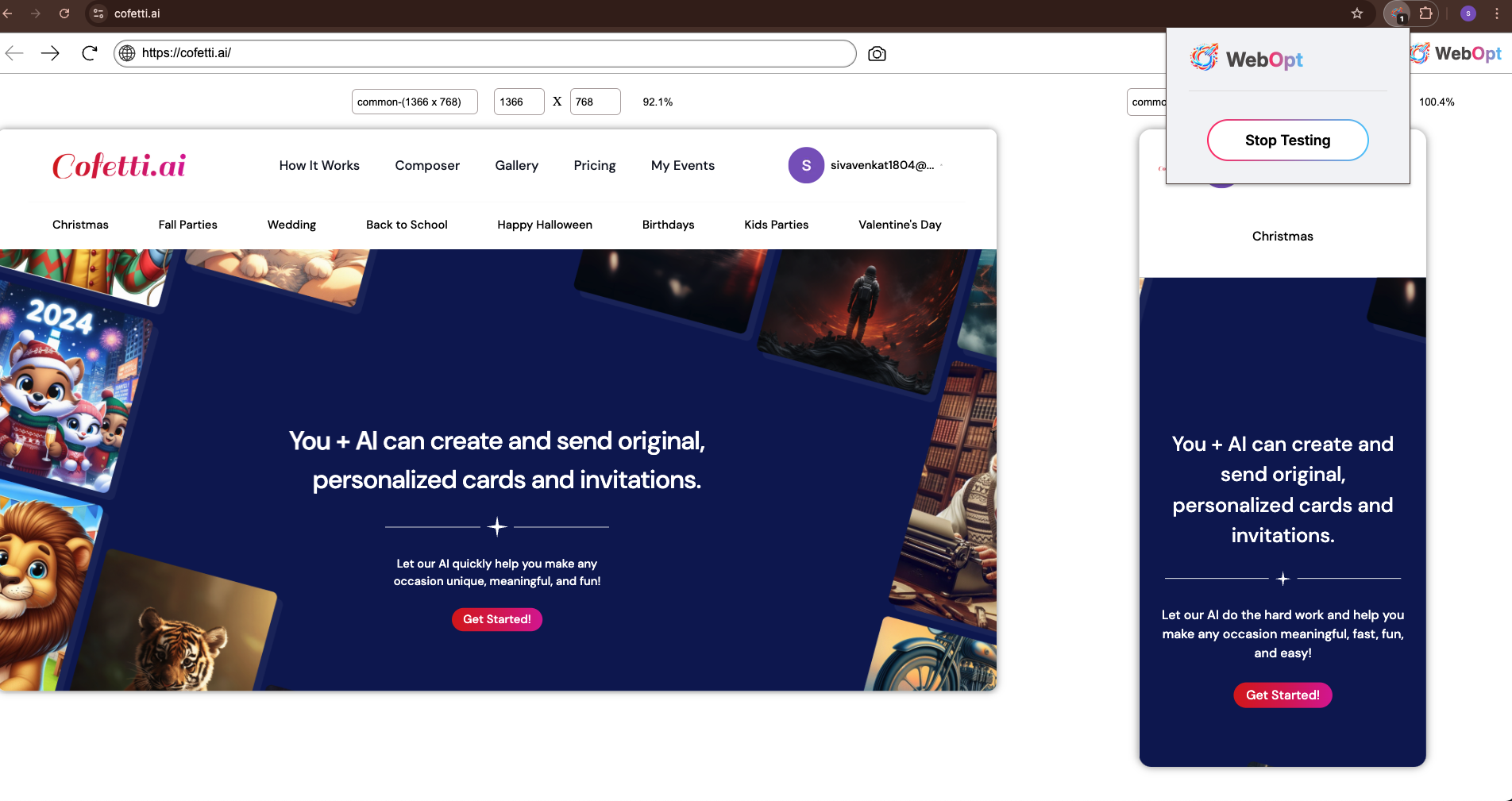
9. After testing the website to click the 'Stop Testing' button .
10. This image shows a design review process for a website in both desktop and mobile views. It appears to use a tool to analyze and optimize layouts for different screen sizes, with features for creating issues, downloading, and previewing responsive designs .